This used to be a fork of ldn0x7dc/react-native-gallery but since the author has stopped maintaining it, here's our own repo. Props to him for his work !
A pure JavaScript image gallery component for react-native apps with common gestures like pan, pinch and doubleTap, supporting both iOS and Android.
This component aims to be (one of) the best image viewer for react-native apps. Comparing with other gallery alike components, this one should be more elegant in following aspects: (mimics iOS system photo album app).
- Gesture handle: besides common pan, pinch and doubleTap, this component does well in targeting foucs point( or pivot) when zoom-in and zoom-out.
- Responder switch: the gesture responder switch is more flexible than any other component, that is, the scrollable container and the wrapped image children perform well in acquiring and releasing gesture responder from/to each other.
This component utilizes @ldn0x7dc/react-native-view-pager as the scrollable container and react-native-transformable-image as the wrapped image.
This component works on react-native 0.28+.
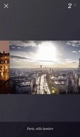
You can try this example live in Archriss' showcase app on Android and iOS or check out the demo.
npm install --save react-native-image-gallery or yarn add react-native-image-gallery
import Gallery from 'react-native-image-gallery';

  render() {
    return (
      <Gallery
        style={{ flex: 1, backgroundColor: 'black' }}
        images={[
          { source: require('yourApp/image.png'), dimensions: { width: 150, height: 150 } },
          { source: { uri: 'http://i.imgur.com/XP2BE7q.jpg' } },
          { source: { uri: 'http://i.imgur.com/5nltiUd.jpg' } },
          { source: { uri: 'http://i.imgur.com/6vOahbP.jpg' } },
          { source: { uri: 'http://i.imgur.com/kj5VXtG.jpg' } }
        ]}
      />
    );
}You can now use either a remote image, by specifying source.uri, or a local image where source is the result of your require().
Be aware that you need to pass the dimensions of your local images ! It's still not required for remotes images, although you can still provide their dimensions to prevent the gallery from fetching their height and width online, which can improve the perfs a bit.
| Prop | Description | Type | Default |
|---|---|---|---|
images |
Your array of images | array |
Required |
initialPage |
Image displayed first | number |
0 |
imageComponent |
Custom function to render your images, 1st param is the image props, 2nd is its dimensions | function |
<Image> component |
errorComponent |
Custom function to render the page of an image that couldn't be displayed | function |
A <View> with a stylized error |
flatListProps |
Props to be passed to the underlying FlatList |
object |
{windowSize: 3} |
pageMargin |
Blank space to show between images | number |
0 |
onPageSelected |
Fired with the index of page that has been selected | function |
|
onPageScrollStateChanged |
Called when page scrolling state has changed, see scroll state and events | function |
|
onPageScroll |
Scroll event, see scroll state and events | function |
|
scrollViewStyle |
Custom style for the FlatList component |
object |
{} |
onSingleTapConfirmed |
Fired after a single tap | function |
|
onLongPress |
Fire after a long press | function |
-
onPageScroll: (event) => {}.The event object carries following data:
position: index of first page from the left that is currently visible.offset: value from range [0,1) describing stage between page transitions.fraction: means that (1 - x) fraction of the page at "position" index is visible, and x fraction of the next page is visible.
-
onPageScrollStateChanged: (state) => {}.Called when the page scrolling state has changed. The page scrolling state can be in 3 states:
'idle': there is no interaction with the page scroller happening at the time.'dragging': there is currently an interaction with the page scroller.'settling': there was an interaction with the page scroller, and the page scroller is now finishing it's closing or opening animation.